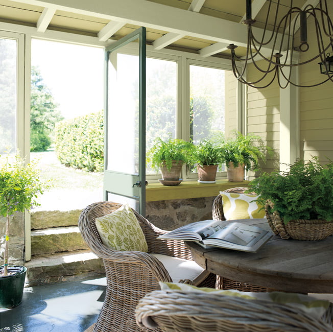
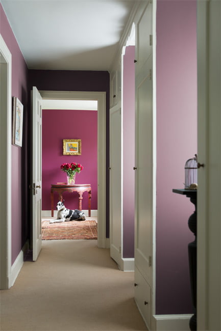
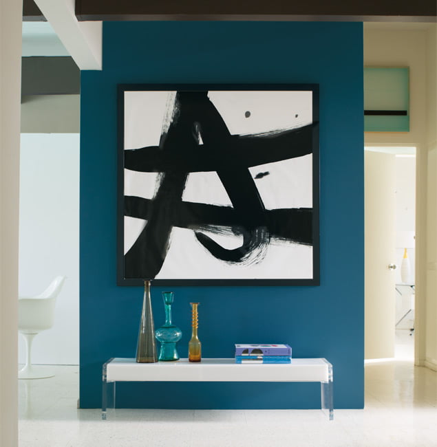
Seamless color flow from room to room culminates in a well-considered, visually pleasing space.
Warm berries, crisp blues, earthly greens and soft blushes come together for a monochromatic concept that gracefully breezes through a home.
The Color Palette
This palette of 23 colors offers warm, cool, dark and light layers of the same hue. It’s one monochromatic concept gracefully flowing room to room.
A Gathering of Green
Nature’s neutral, green is versatility exemplified.
The interplay of several green hues seen in this monochromatic color scheme includes Timothy Straw 2149-40, Split Pea 2146-30 and Guilford Green HC-116, the latter a fresh, silvery sage and Benjamin Moore’s selection for the 2015 Color of the Year. Greens also pair organically with wood, metal and stone.
Go with the Color Flow
The Color and Design Team at Benjamin Moore took a fresh look at monochromatic color combinations when developing the Benjamin Moore Color Trends palette for 2015.
Our experts played with ratio and proportion of color, from room to room. In one room, one color is an accent – while in the next room, it can be the hero, or main color.
Your sightline–or the other rooms you can see from the room you are standing in–is another factor. Monochromatic color schemes empower you to be color diverse, but still present a cohesive, harmonious color flow.
“WORKING WITH A MONOCHROMATIC PALETTE SIMPLIFIES COLOR CHOICE WITHOUT SACRIFICING STYLE.”
The Art of Layering
While our palette of monochromatic families makes experimenting with color simple, the results are highly sophisticated.
Colors with deeper saturation can be beautifully offset with a spectrum of lighter hues. Layering these colors, and then adding textures and other materials-think metal, leather, bold prints-evokes color confidence.
Pair with Your Choice of Product
Colors mentioned here are available for use in a range of Benjamin Moore paints. Explore the product that’s right for you in The Right Paint or Stain for your Project section.
—Andrea Magno
COLOR & DESIGN EXPERT
The Color Palette
This palette of 23 colors offers warm, cool, dark and light layers of the same hue. It’s one monochromatic concept gracefully flowing room to room.
Patriotic White
2135-70
OC-65
Seahorse
2028-70
Blue Hydrangea
2062-60
Timothy Straw
2149-40
Blue Danube
2062-30
Carter Plum
CW-355
Jack Pine
692
Pink Damask
OC-72
Soft Sand
2106-60
Guilford Green
HC-116
Cinnamon Slate
2113-40
High Park
467
Universal Black
2118-10
Silver Fox
2108-50
Split Pea
2146-30
Go with the Color Flow
The Color and Design Team at Benjamin Moore took a fresh look at monochromatic color combinations when developing the Benjamin Moore Color Trends palette for 2015.
Our experts played with ratio and proportion of color, from room to room. In one room, one color is an accent – while in the next room, it can be the hero, or main color.
Your sightline–or the other rooms you can see from the room you are standing in–is another factor. Monochromatic color schemes empower you to be color diverse, but still present a cohesive, harmonious color flow.
A Gathering of Green
Nature’s neutral, green is versatility exemplified.
The interplay of several green hues seen in this monochromatic color scheme includes Timothy Straw 2149-40, Split Pea 2146-30 and Guilford Green HC-116, the latter a fresh, silvery sage and Benjamin Moore’s selection for the 2015 Color of the Year. Greens also pair organically with wood, metal and stone.
“WORKING WITH A MONOCHROMATIC PALETTE SIMPLIFIES COLOR CHOICE WITHOUT SACRIFICING STYLE.”
The Art of Layering
While our palette of monochromatic families makes experimenting with color simple, the results are highly sophisticated.
Colors with deeper saturation can be beautifully offset with a spectrum of lighter hues. Layering these colors, and then adding textures and other materials-think metal, leather, bold prints-evokes color confidence.
Pair with Your Choice of Product
Colors mentioned here are available for use in a range of Benjamin Moore paints. Explore the product that’s right for you in The Right Paint or Stain for your Project section.
—Andrea Magno
COLOR & DESIGN EXPERT
Questions?
we're here for you.
Frequently Asked Questions
When touching up a hole repair, why do I notice a difference, why is the color different?
Paint ages and loses sheen over time, so even within 3 months of painting, the wall is now less shiny than the touch up, meaning it will stand out more. In time the touch up will dull down and blend in a little, but the touchup must be applied lightly in order to keep the wall looking as close to uniform as possible.
Should I do two coats?
You should always do two coats for the following reasons:
-Uniform color - if you only do one coat there is no guarantee that the color will be uniform if the previous color is showing through due to improper film build.
-When doing a color change you should definitely not rely on one coat, depending on what you’re changing to, 2 coats is usually enough.
Do I need to prime?
Priming is necessary when you have new drywall/drywall mud to seal it so that it doesn’t absorb more paint than is needed. Also if doing a color change from dark to light 1 coat of primer might be recommended in order to achieve the desired color.
Why do I need to wait for the paint to dry?
The re-coat window is necessary to ensure that your 2nd coat doesn’t re-wet the first coat. Applying paint too early can just re-activate the previously applied coat of paint, meaning that you don’t get a proper two coat film build, and so it doesn’t cover as two proper coats.
How long do I wait to be able to wash my walls
Most paints require 28 days to full harden and cure, giving you maximum durability for the product. only ever wash your walls with warm soapy water, avoiding bleach or ammonia based cleaning products.


